Glossy Beauty Bar Brand Identity
A Branding Foundations Project
Glossy Beauty Bar brings hair, nails, lashes, brows, waxing, massage, and facials under one roof, so clients can book a full beauty day without jumping between studios. The brand needed to feel as seamless as the service itself: warm, polished, and easy to recognize whether someone is scrolling a booking page or walking through the door.
I built the identity from the wordmark out, pairing a fluid script logo with a bright, glossy palette and a type system that moves between editorial and everyday. The result is a flexible brand kit for menus, packaging, signage, and social, designed to hold together across every appointment and every touchpoint.
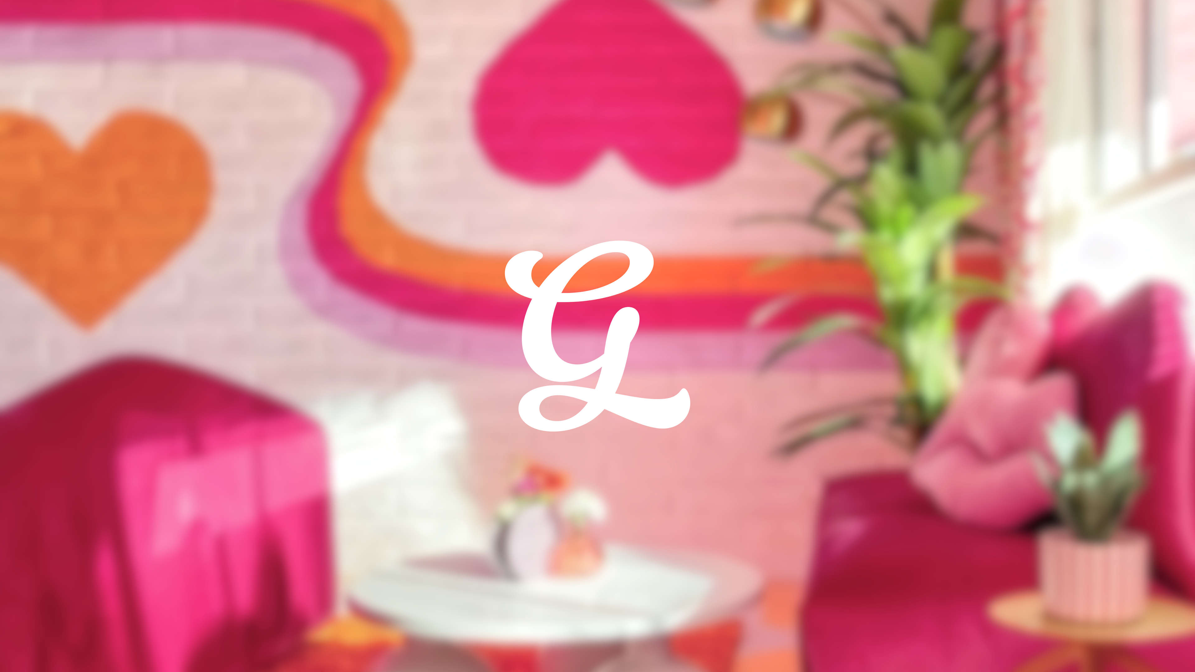
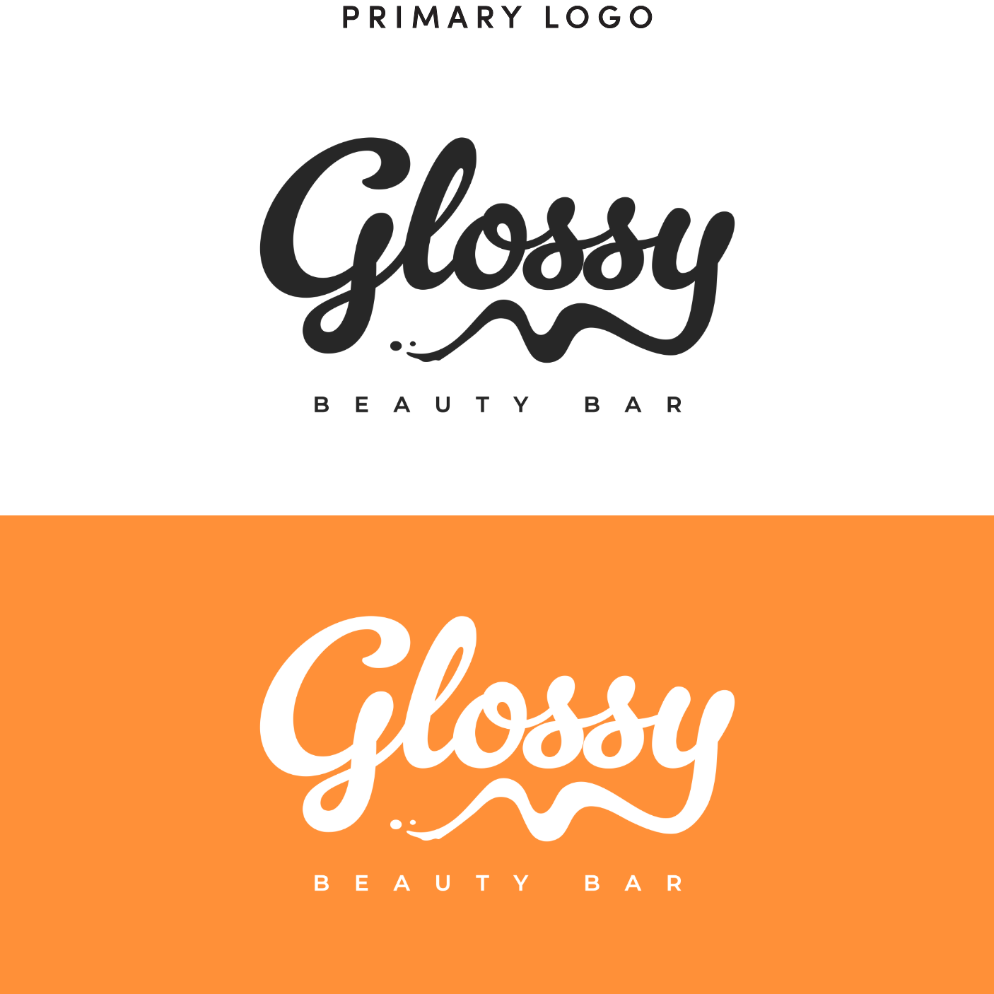
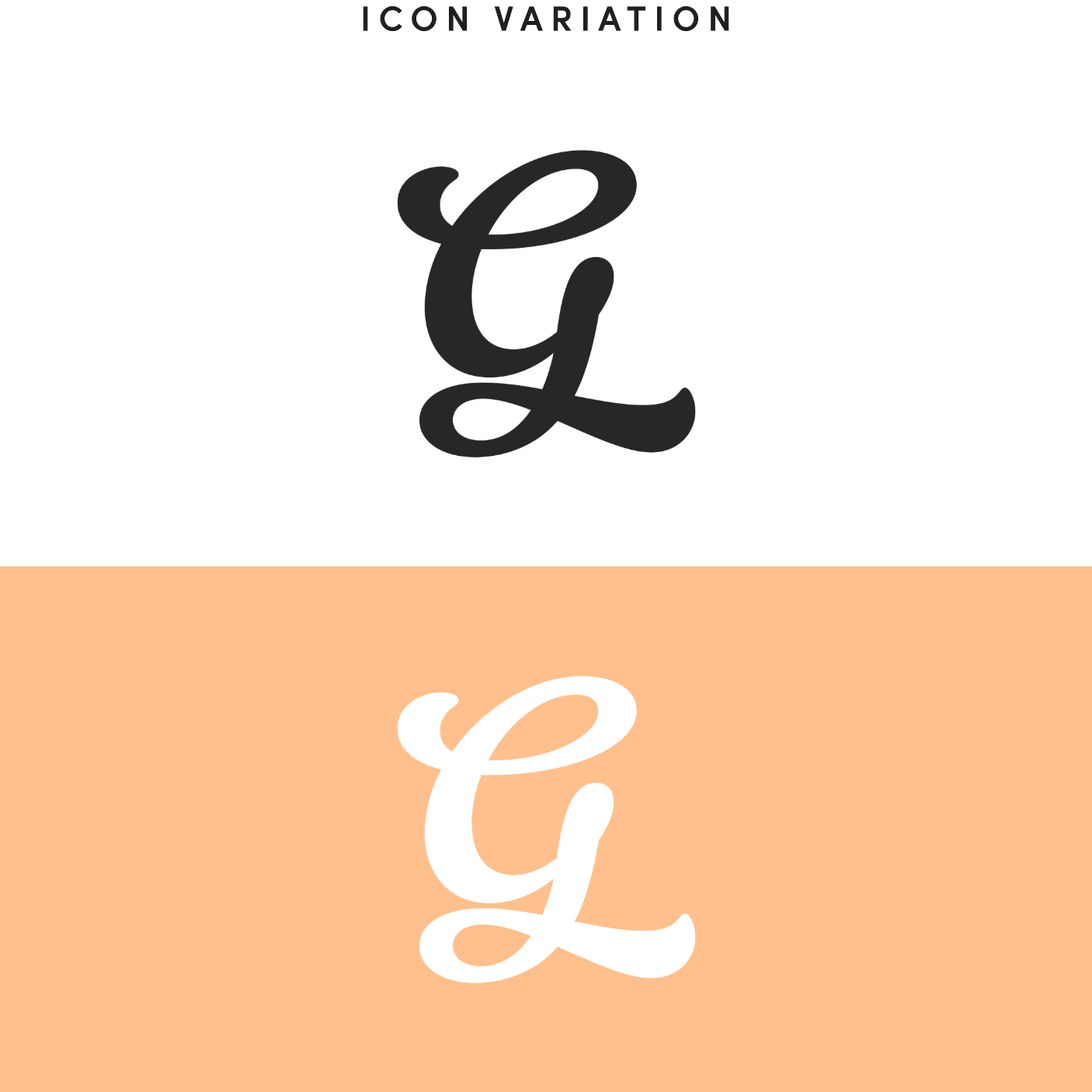
The Glossy Beauty Bar logo system was designed to feel fluid, feminine, and instantly recognizable across both digital and physical environments. The primary logo is a stacked lockup built around a custom script wordmark, with a soft underline flourish and a widely tracked “BEAUTY BAR” descriptor beneath it, creating a mark that feels polished and expressive. The icon variation is a stand-alone monogram drawn from the same script, distilling the brand into a single elegant form. This version was created for merchandise, social avatars, and small-format applications where the full word mark would be less practical.
FONTS
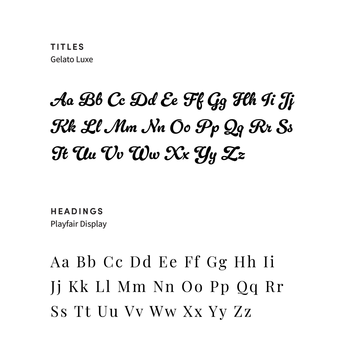
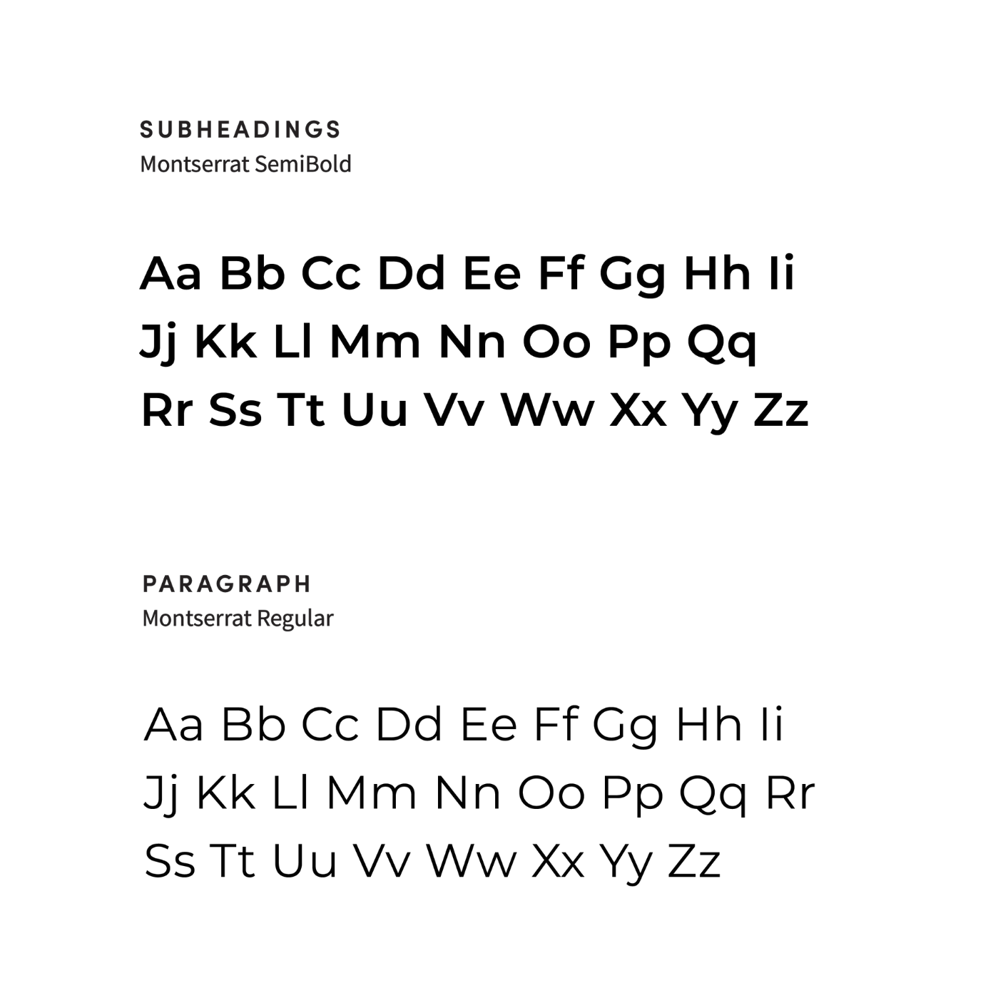
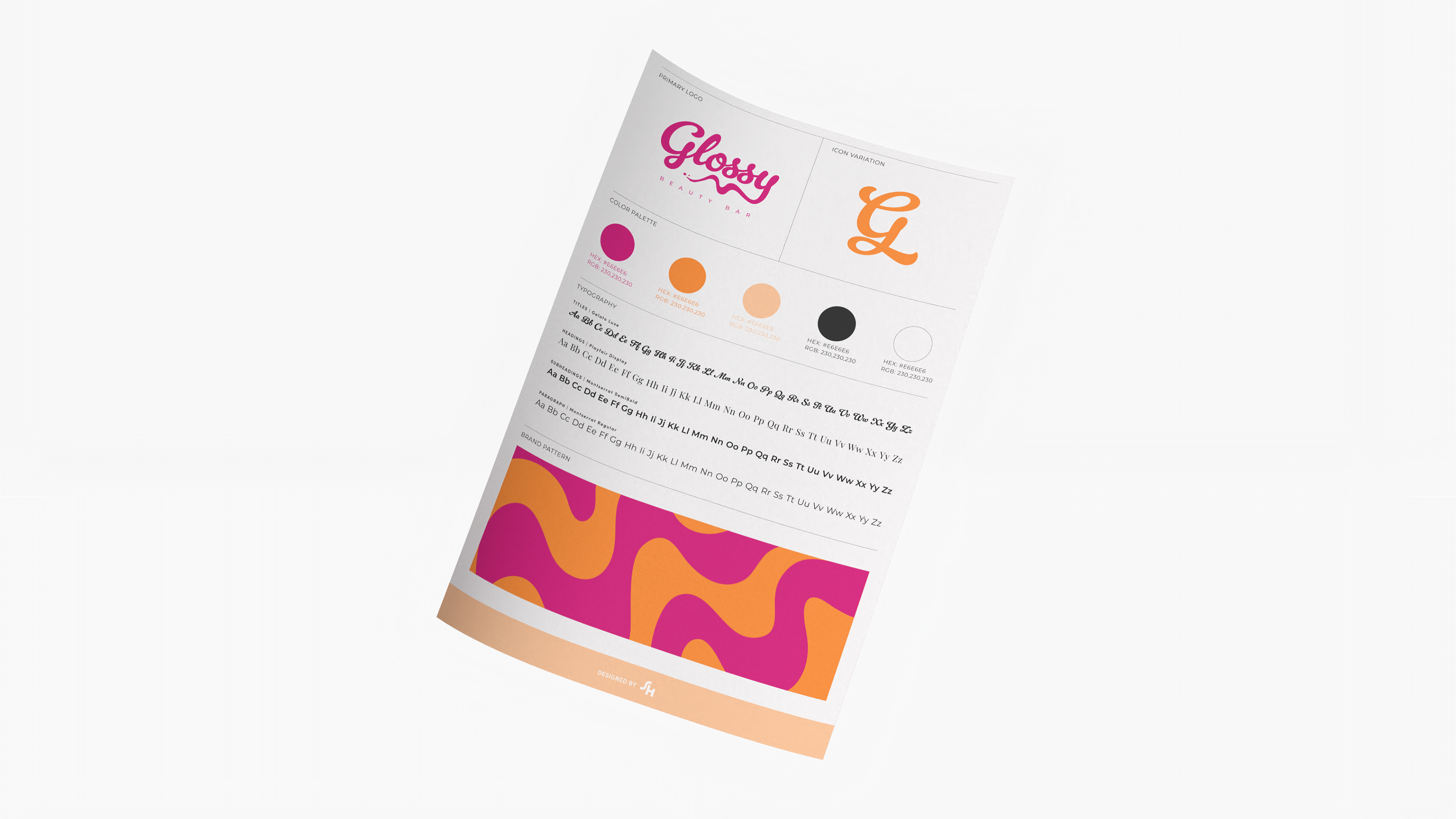
The Glossy Beauty Bar type system pairs expressive script with clean, modern type so the brand feels polished without losing warmth. Gelato Luxe is reserved for titles, carrying the same fluid, handwritten energy as the wordmark and giving campaigns and hero moments a soft, glossy finish. Playfair Display handles headings, adding a refined serif contrast that feels elegant and editorial. Montserrat SemiBold is used for subheadings, offering clear structure and a confident contemporary edge, while Montserrat Regular carries body copy for easy reading across digital and print. Together, the pairings keep the identity consistent: script for personality, serif for elegance, and sans serif for clarity.
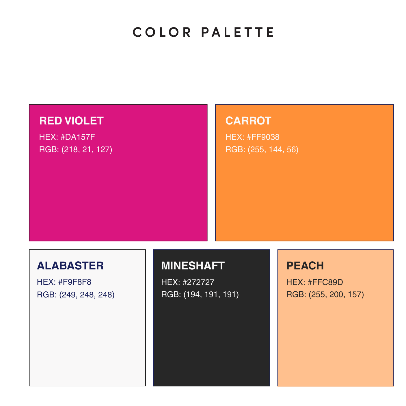
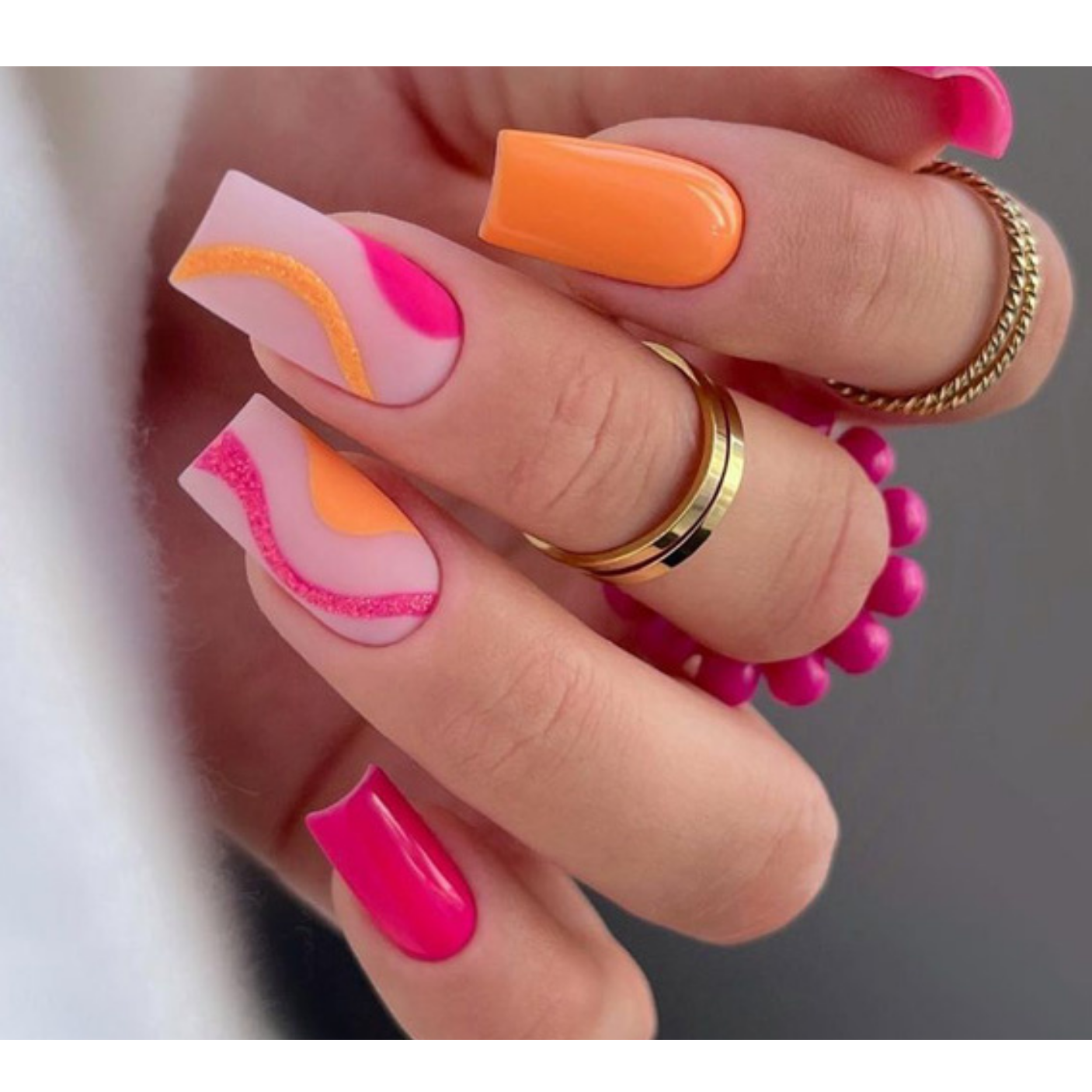
The Glossy Beauty Bar palette balances bold color with soft neutrals so the brand feels lively and polished. Red Violet is the signature accent, vivid and glossy, while Carrot adds a warm, energetic contrast for highlights and calls to action. Peach softens the system into a blush tone suited to backgrounds and secondary moments, and Alabaster keeps layouts light and clean. Mineshaft anchors the palette as the primary text and logo color, giving the brighter hues definition. Used together, the colors stay consistent from packaging and signage to digital and in-store applications.
BRAND GUIDE