Amp Coffee Co. Brand Identity
A Branding Essentials Project
AMP Coffee Co. is a small-batch café targeting creatives, remote workers, and caffeine die-hards. They approached me for a Branding Essentials package to develop a bold, high-impact identity that could live across digital and physical spaces. The scope included a logo system, color palette, typography, social templates, and basic print collateral.
The client requested a visual tone that felt loud, rebellious, and unapologetic; centered around a red-and-black palette and a logo that could double as a merch stamp. I led creative direction, built out scalable assets, and ensured every element reflected the brand’s energy without relying on cliché coffee aesthetics.

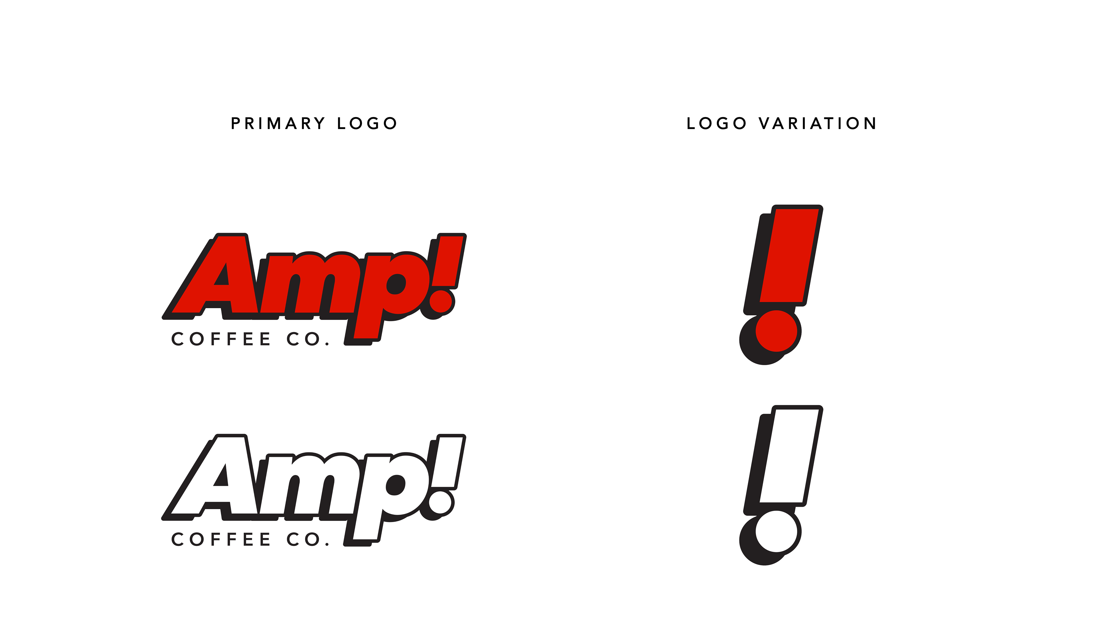
The logo system was designed to be bold, scalable, and instantly recognizable. The primary logo features a custom wordmark with exaggerated punctuation to reflect the brand’s energetic tone. For the logo variation, the client specifically requested a simple icon-only version; a minimal mark that could be used on merchandise, social media avatars, and small-format applications where a full logo would be too complex. This approach helps maintain brand recognition across diverse touchpoints without compromising clarity.
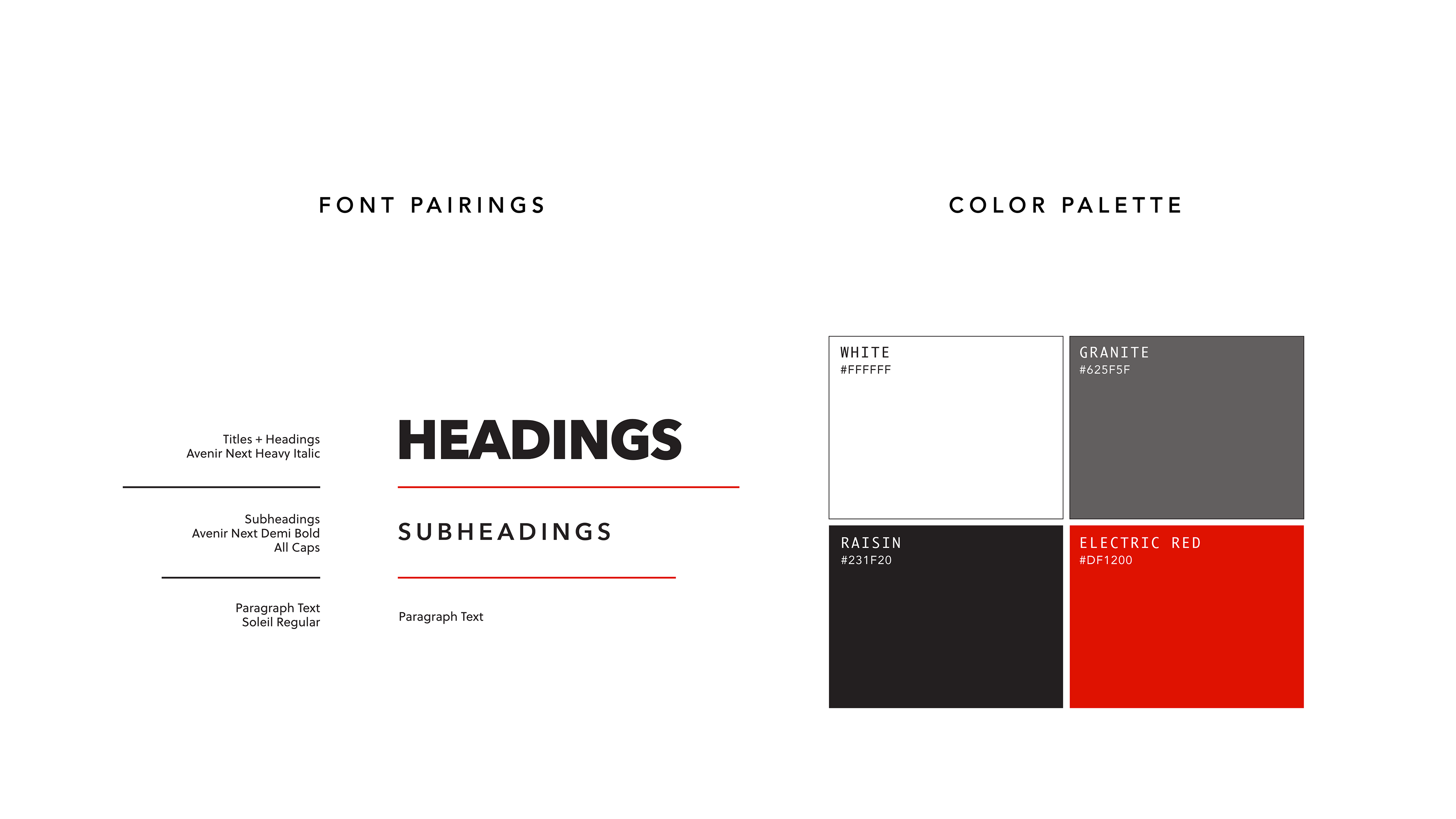
Amp’s palette includes Electric Red, Raisin Black, Granite Gray, and White; each selected for emotional impact and contrast. Electric Red serves as the primary brand color, chosen for its intensity and visibility. Typography pairs a heavy sans-serif for headlines with a clean geometric font for body text, reinforcing the brand’s clarity and punch. These elements work together to create a visual language that’s bold, modern, and unapologetically direct.
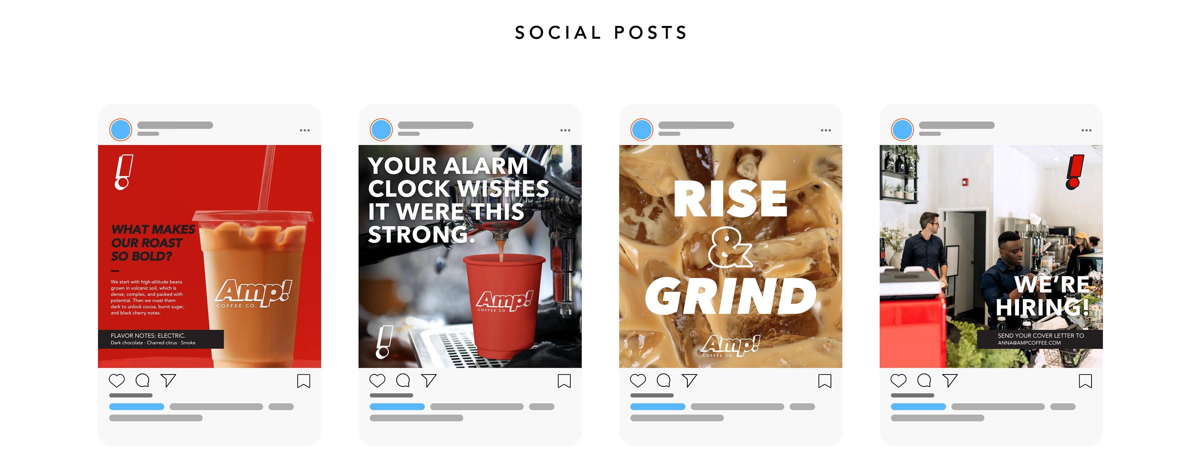
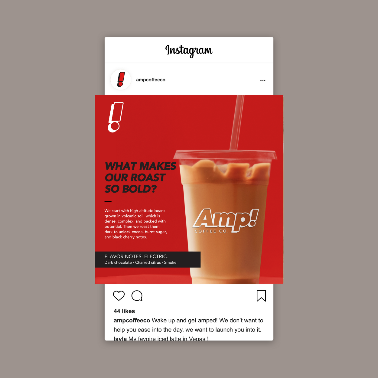
Social templates were created to help AMP show up consistently and memorably across digital platforms. Each post uses bold messaging paired with high-contrast visuals and the icon-only logo. The layouts are designed to be scroll-stopping, easy to update, and aligned with the brand’s loud, energetic tone. These templates give the client a flexible system for ongoing content creation.
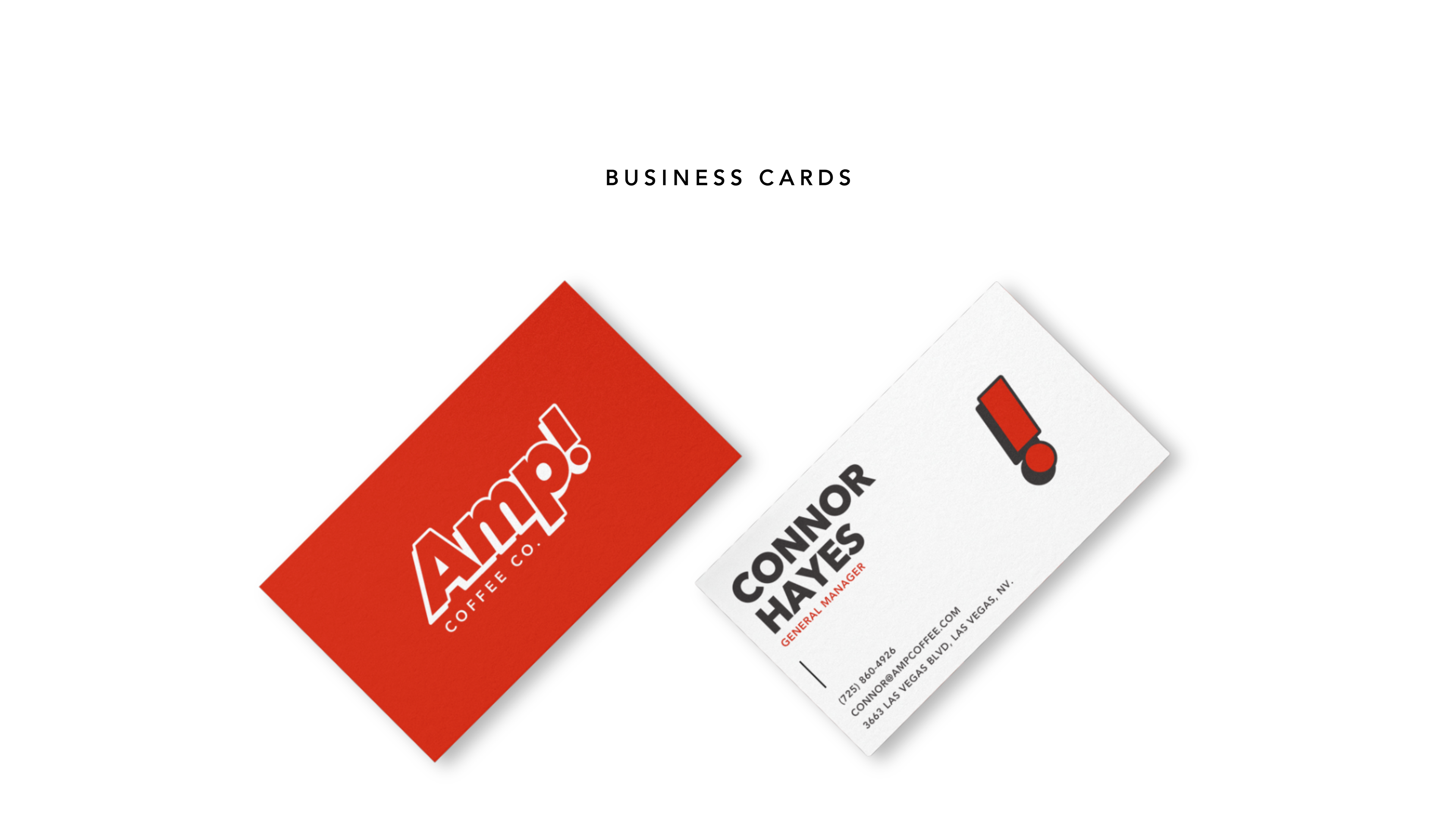
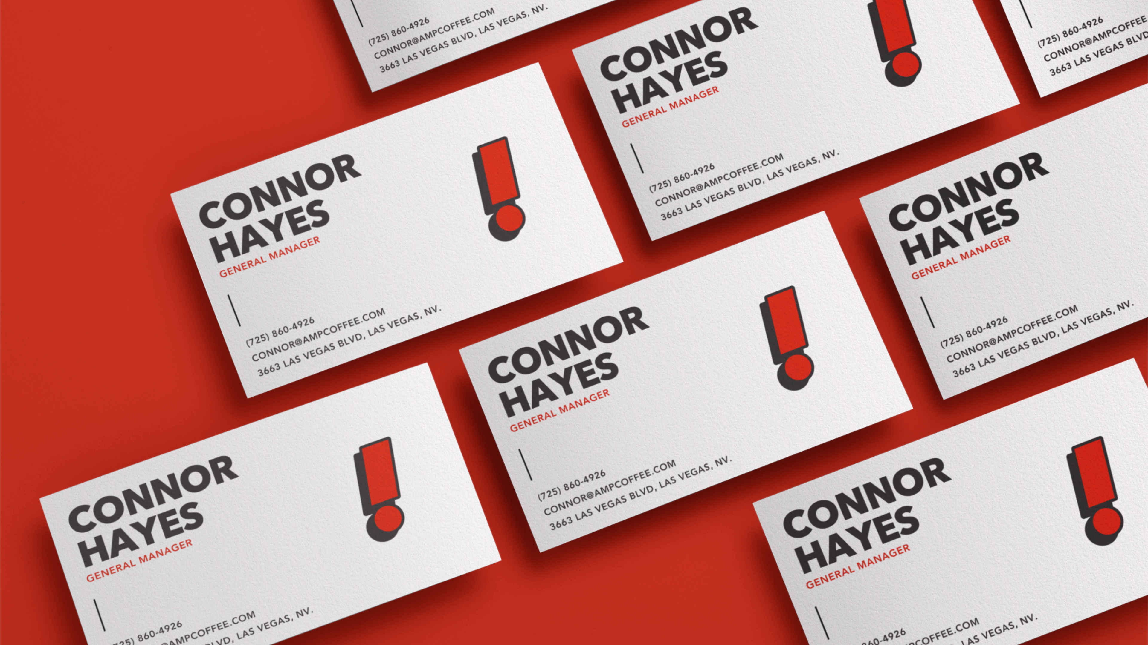
Print collateral was kept minimal but impactful. The business card features the icon-only logo on one side and a full Electric Red background on the other, creating a bold first impression. The letterhead uses a clean layout with subtle brand accents, balancing professionalism with personality. These materials were designed to be easy to reproduce while maintaining visual consistency across client interactions.
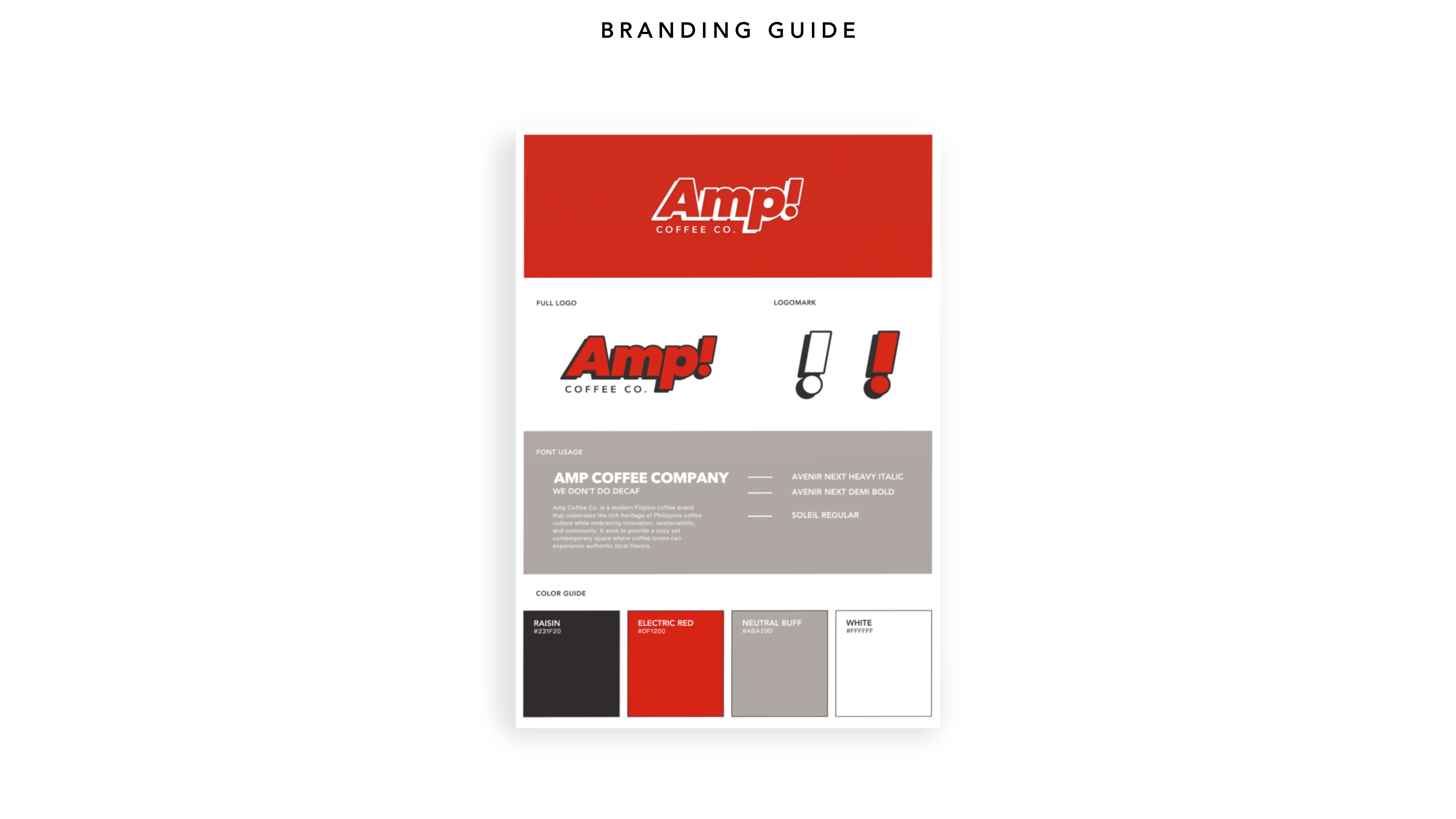
This basic brand guide includes AMP’s core identity elements: logo variations, color palette, and typography pairings. It’s designed to help the client maintain visual consistency across platforms, with clear references for internal use or future collaborators. While not a full usage manual, it provides a solid foundation for applying the brand confidently and cohesively.
AMP Coffee Co.’s refreshed identity captures the energy they bring to every cup: bold, direct, and unapologetically loud. This Essentials package provided the foundational tools they need to show up consistently across digital and physical spaces, including a flexible logo system, high-impact color palette, and scroll-stopping social templates. With a clear visual language and a simple brand guide for reference, AMP is equipped to grow with confidence and clarity; without losing their edge.