The Green Olive Brand Identity
A Complete Branding System Package
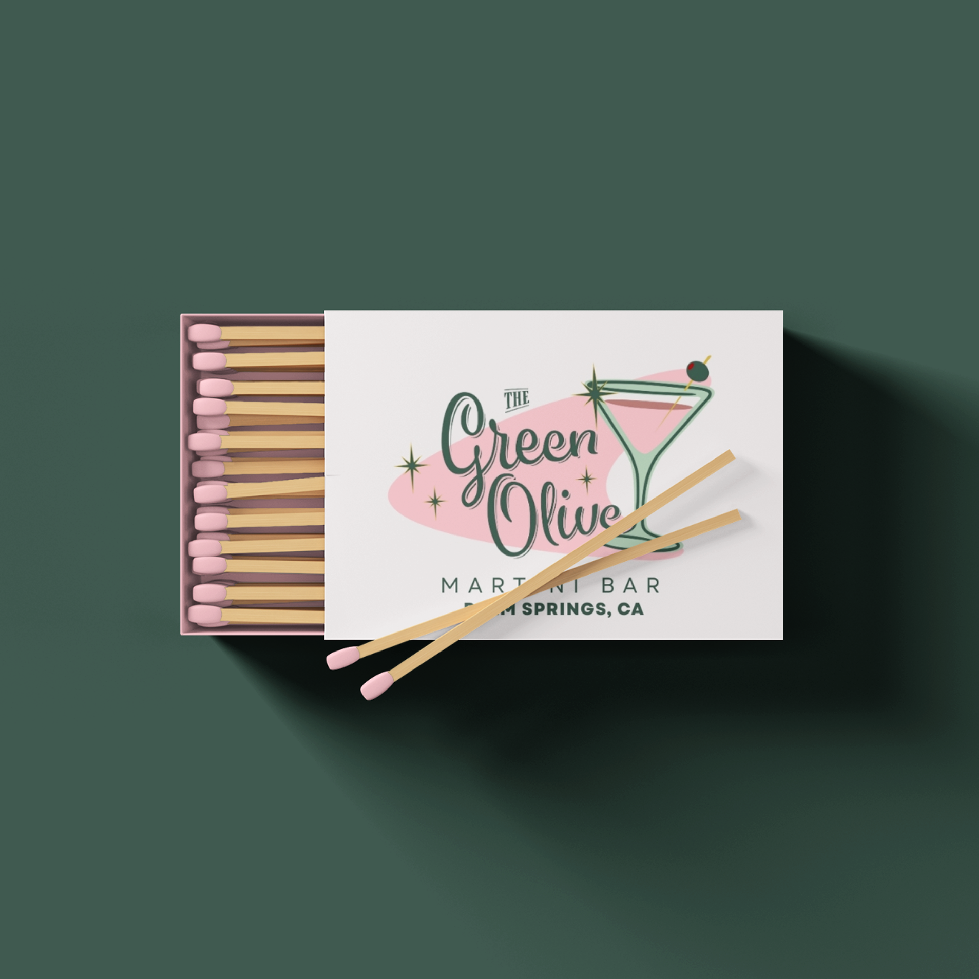
The Green Olive is a Palm Springs martini bar founded on the principle that cocktail experiences should feel sophisticated, approachable, and community-driven. Based in the heart of Palm Springs, they sought a brand identity that captured the city’s vibrant, retro spirit while avoiding the typical desert and mid-century clichés common in local hospitality logos.
The design process focused on creating a mark that conveys elegance, playfulness, and a strong local presence through a fresh, modern lens.
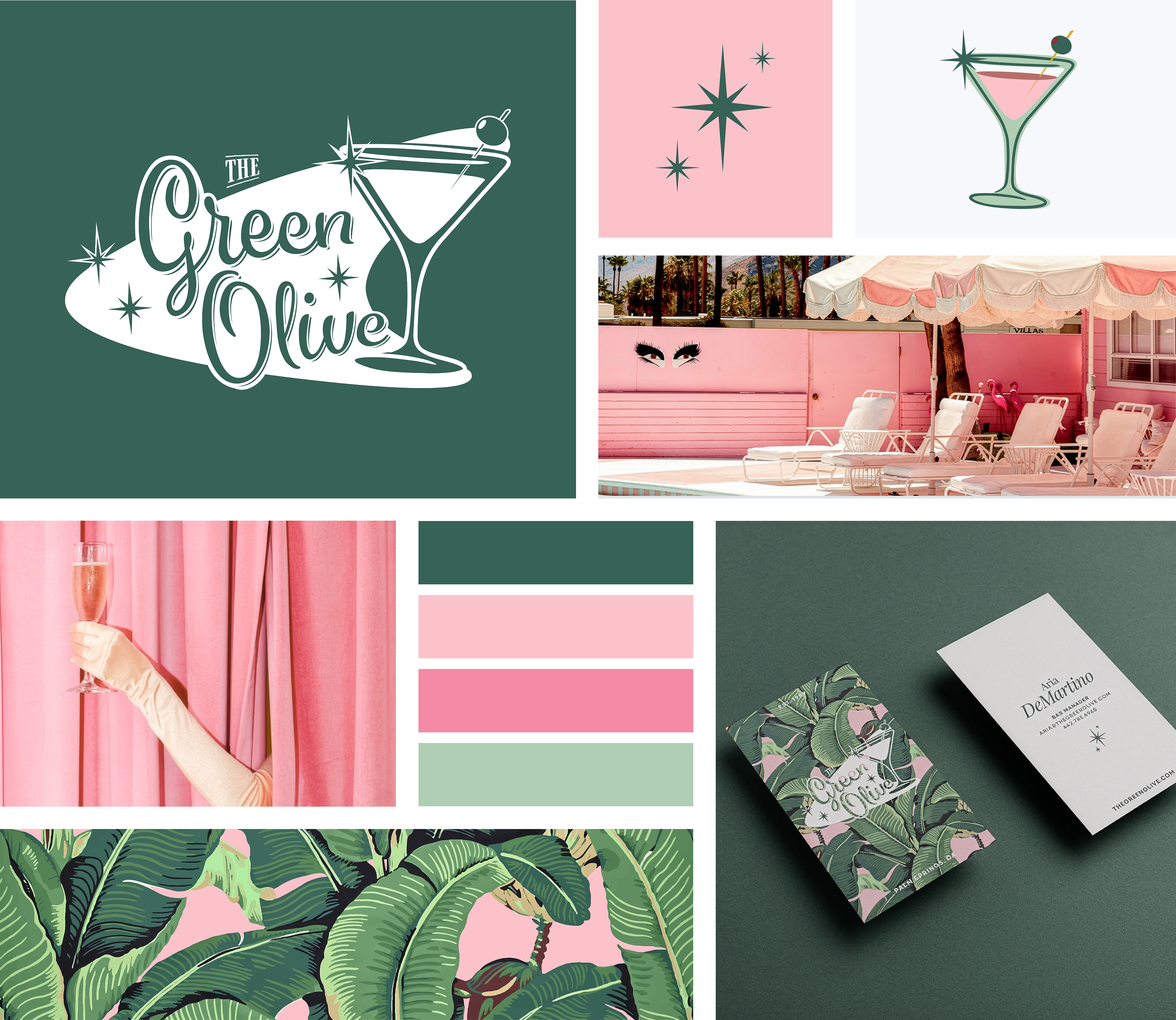
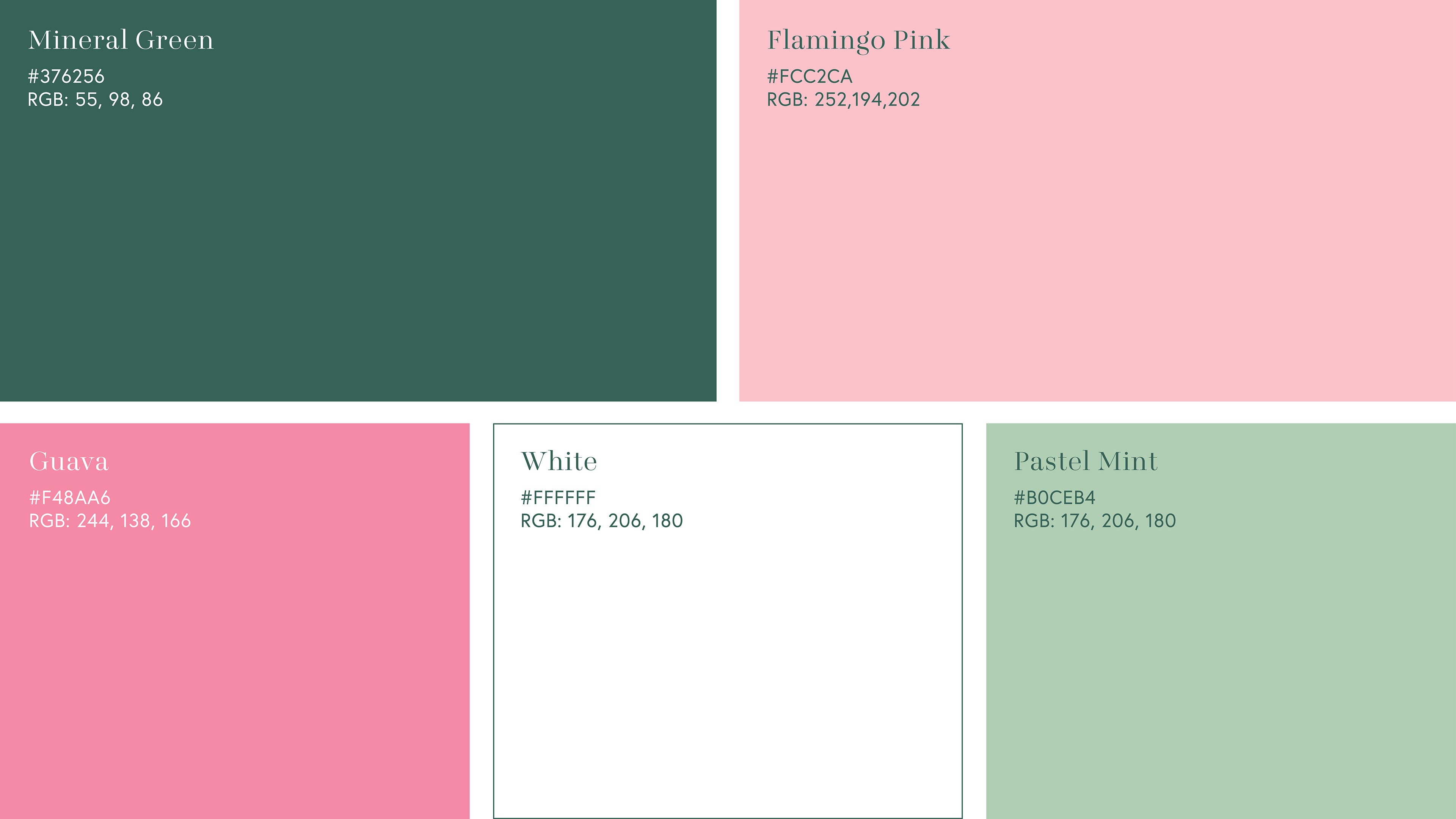
The identity draws inspiration from classic Palm Springs mid-century modern design, utilizing a bold flamingo pink and emerald green color palette. This vibrant combination gives The Green Olive a distinctive, energetic feel that is both nostalgic and contemporary. The resulting brand guide ensures the bar can present itself with clarity and consistency across menus, signage, marketing, and guest experiences.
LOGO DESIGNS
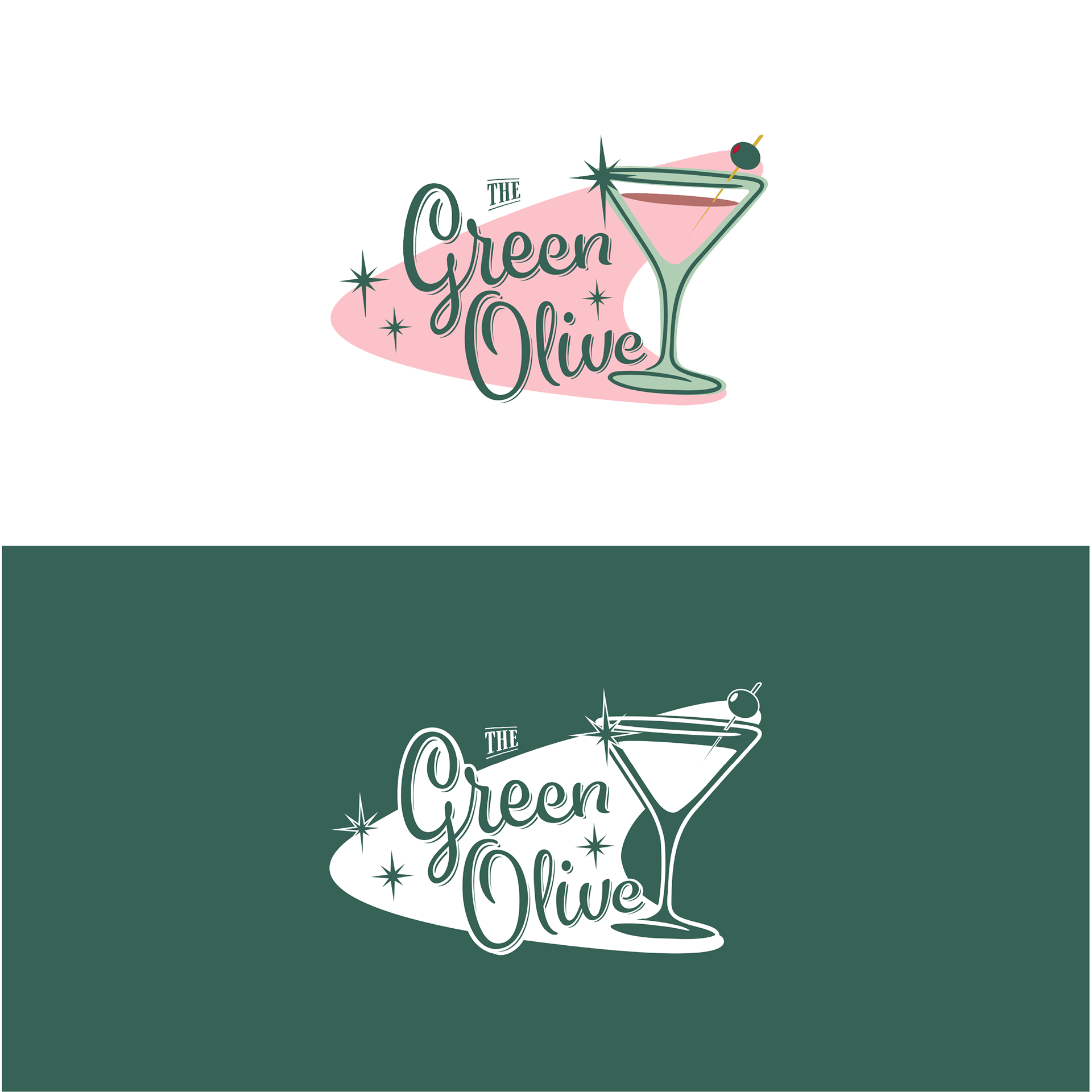
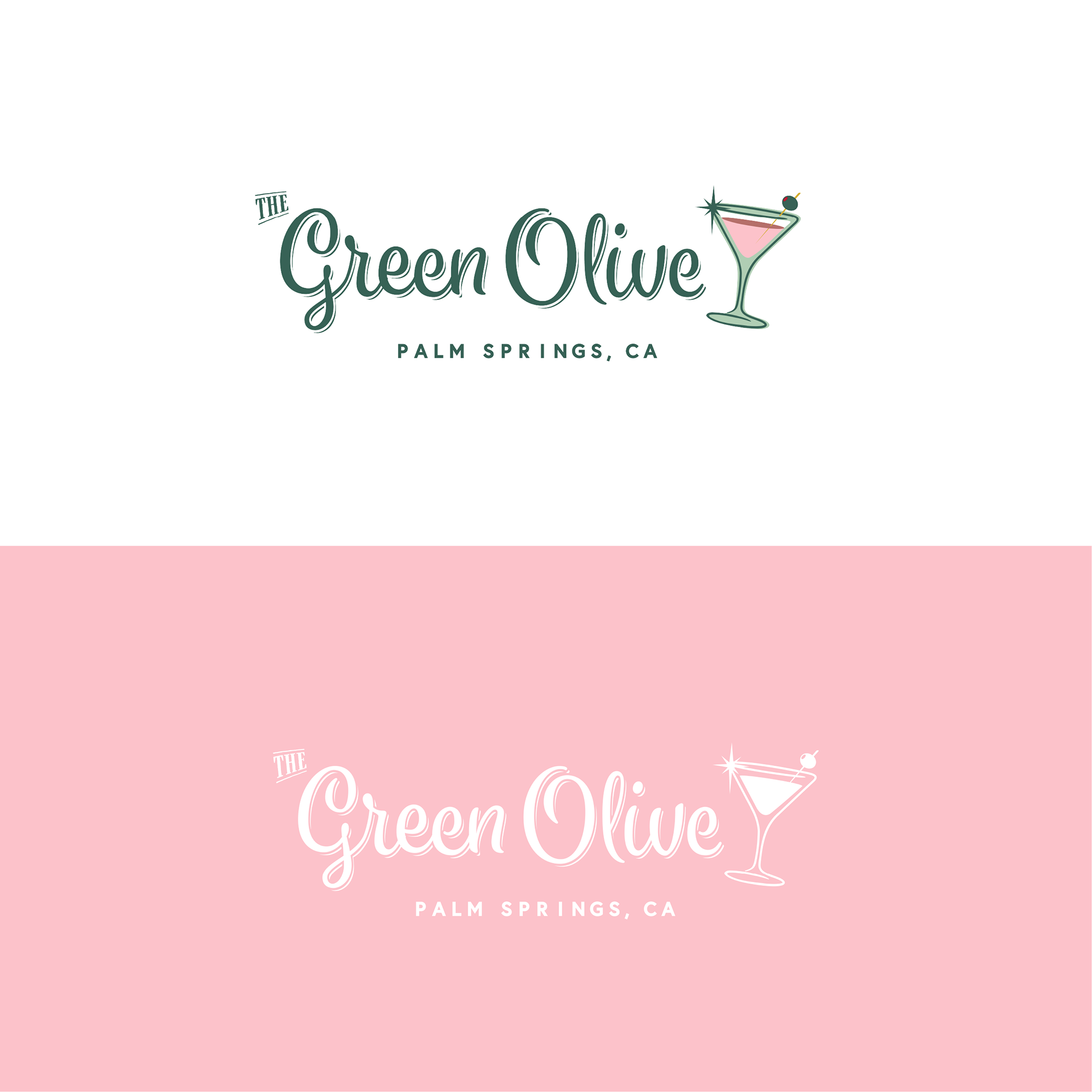

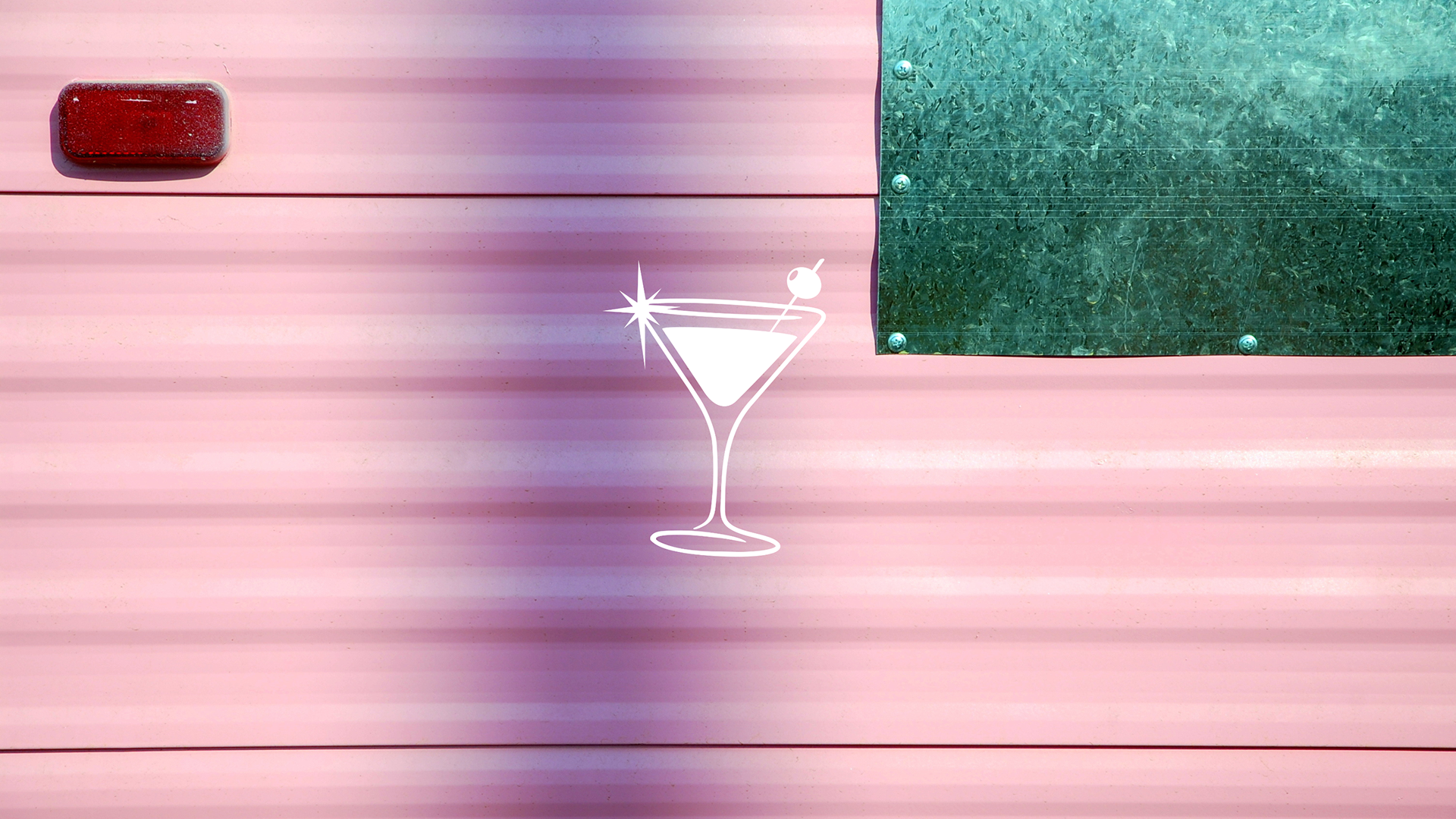
The Green Olive logo system was designed to be playful, elegant, and instantly recognizable across both digital and physical environments. The primary logo is a dynamic horizontal lockup featuring the custom wordmark “The Green Olive” paired with a stylized martini glass icon, creating a balanced and memorable mark that captures the bar’s mid-century modern spirit. The secondary logo is the stand-alone martini glass icon, complete with its signature olive and sparkle, offering a minimal, versatile emblem that distills the brand’s vibrant personality into a single, iconic form. This variation works especially well for merchandise, social media avatars, signage, and small-format applications where the full wordmark may not fit. Together, the system ensures consistency and clarity while allowing the identity to scale seamlessly across diverse touchpoints, from cocktail menus and glassware to digital marketing and storefront applications.
FONT PAIRING

COLOR PALLETTE
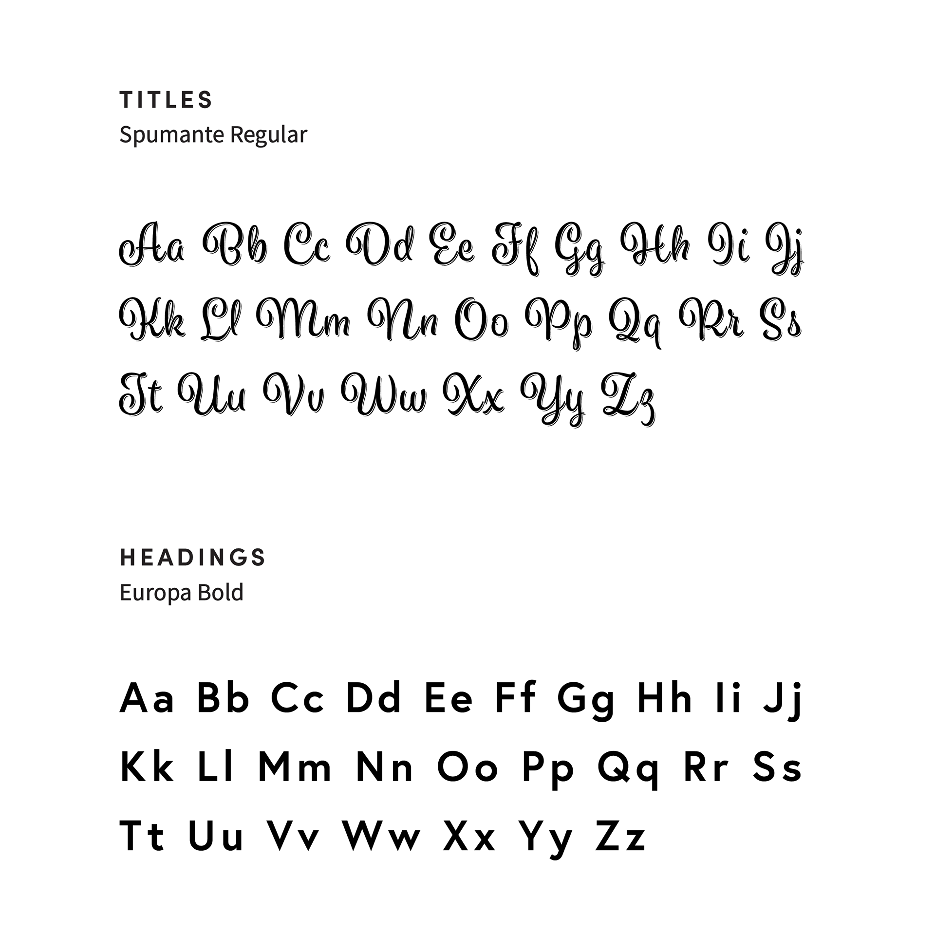
The Green Olive branding system was designed to be elegant, playful, and highly versatile across both digital and physical environments. It pairs Spumante Regular for titles with its fluid, retro script charm and Presti Display for subheadings, creating a sophisticated yet fun hierarchy that reflects the bar’s mid-century modern personality. Europa Bold serves as the heading font, delivering clean, confident structure, while Europa Regular provides highly legible body copy for paragraphs and menus. This thoughtful combination ensures the brand feels cohesive and approachable while maintaining a stylish, retro-glam presence. Together, the font pairings support consistency and clarity across diverse touchpoints, from cocktail menus and signage to social media, merchandise, and guest communications.
BRAND GUIDE

The brand guide was created to document the visual identity system with clarity and elegance. Presented in a stylish printed booklet, it outlines the foundational elements of the brand including logo usage, the flamingo pink and emerald green color palette, typography pairings, pattern applications, iconography, and tone of voice. Each page reflects the brand’s commitment to intentional, retro-glam design and creative consistency, ensuring the identity shines seamlessly across digital, print, signage, menus, merchandise, and guest experiences.
COLLATERAL KIT
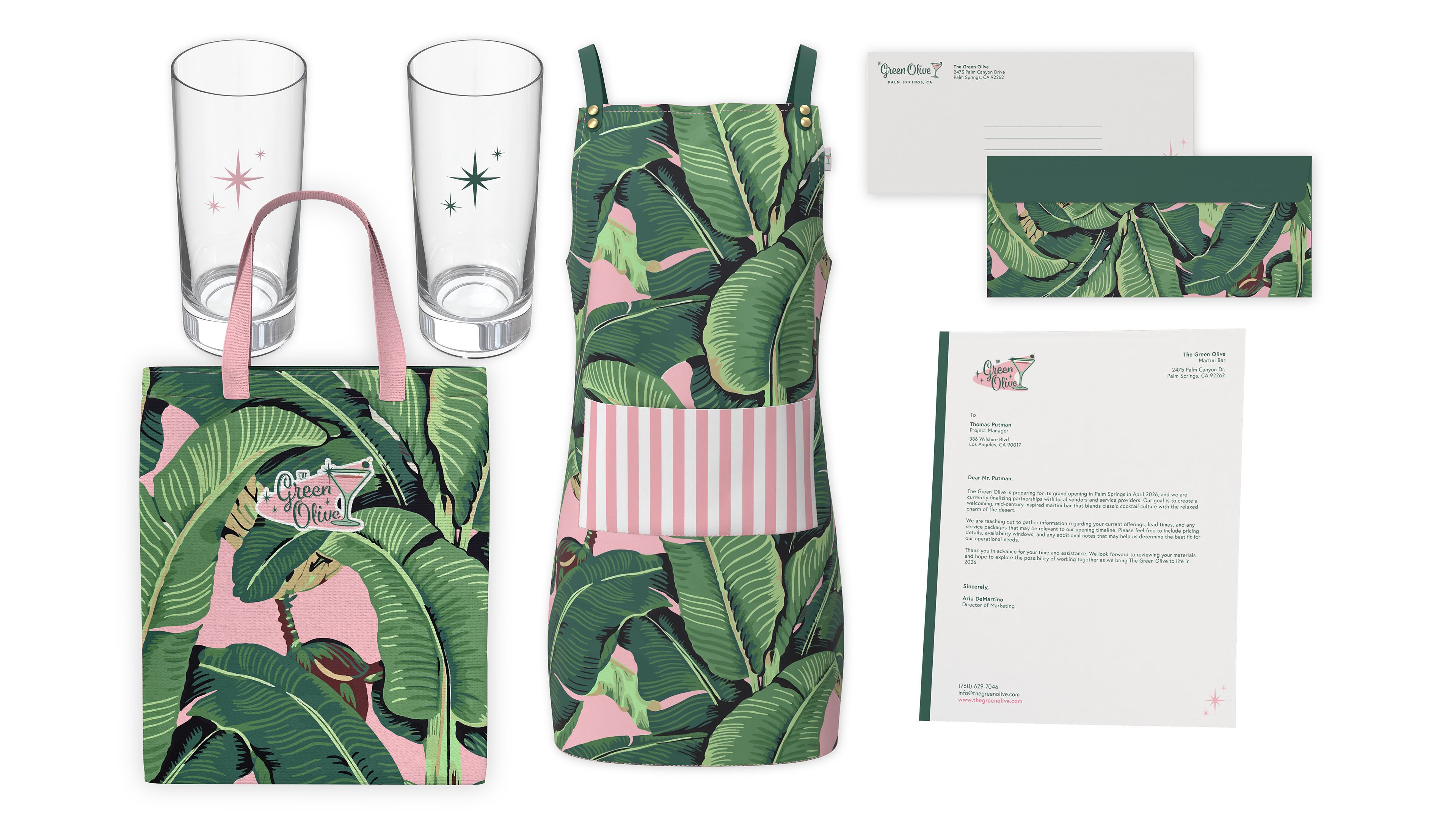
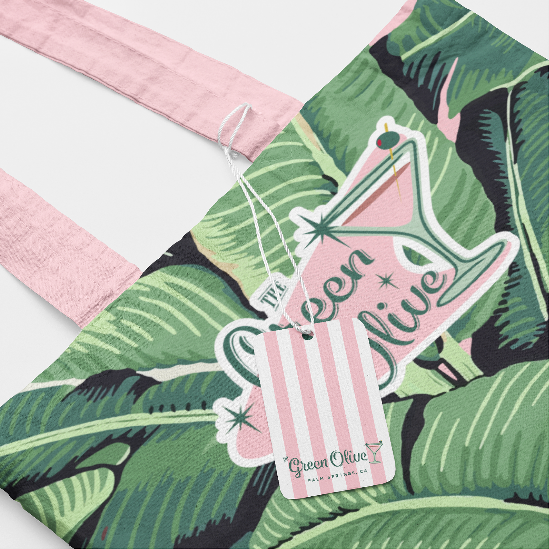
The Green Olive collateral kit extends the brand identity into everyday touchpoints with cohesive, functional, and charming applications. The kit features a custom apron in the signature tropical leaf pattern with pink and emerald green tones, a durable canvas tote bag showcasing the full logo on the iconic banana leaf background, elegant shot glasses adorned with subtle star and martini motifs, and professional stationery including letterhead and envelopes that incorporate the brand pattern and refined typography. These items were designed to maintain visual consistency while bringing the retro-glam, mid-century Palm Springs personality to life.