Finex Brand Identity
A Branding Essentials Project
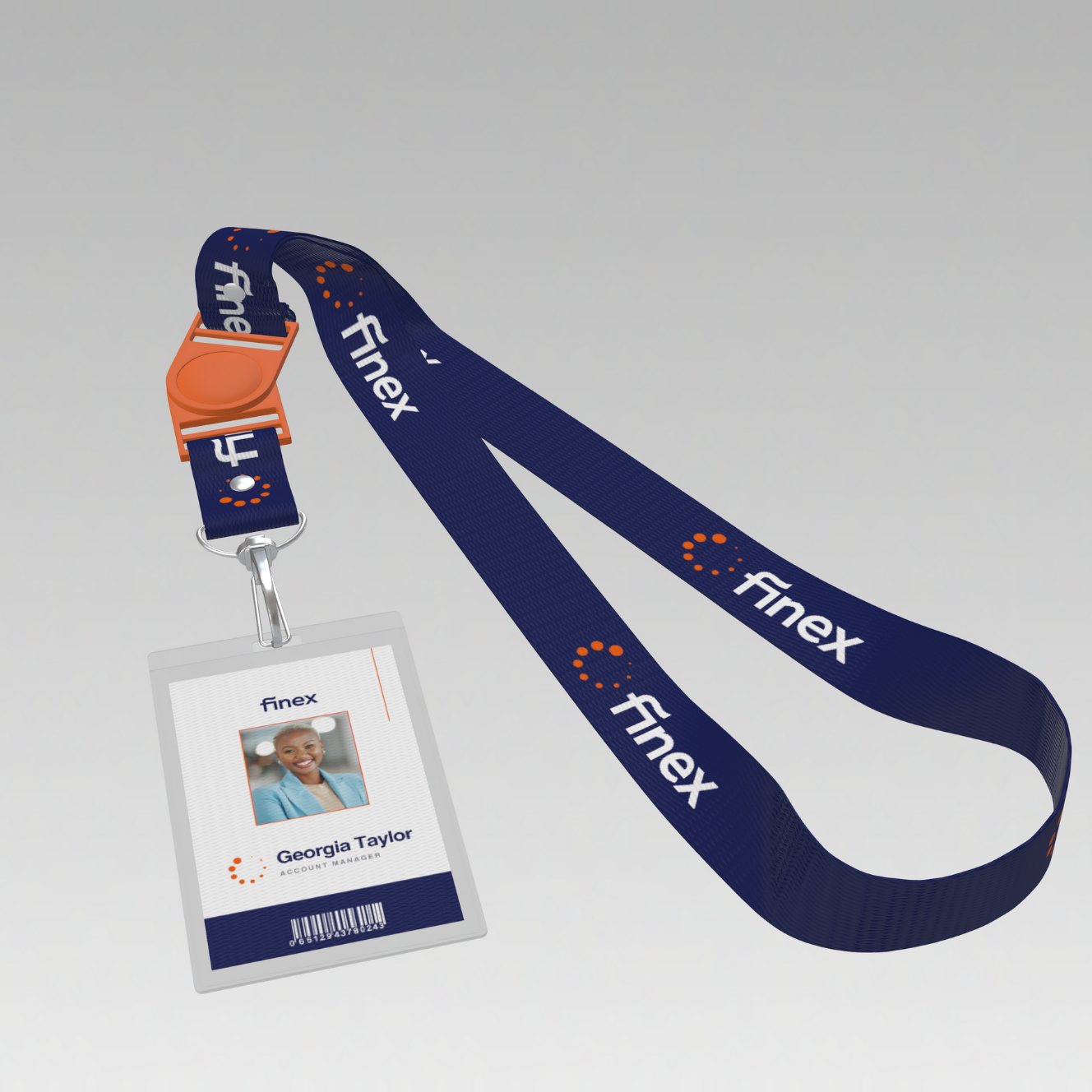
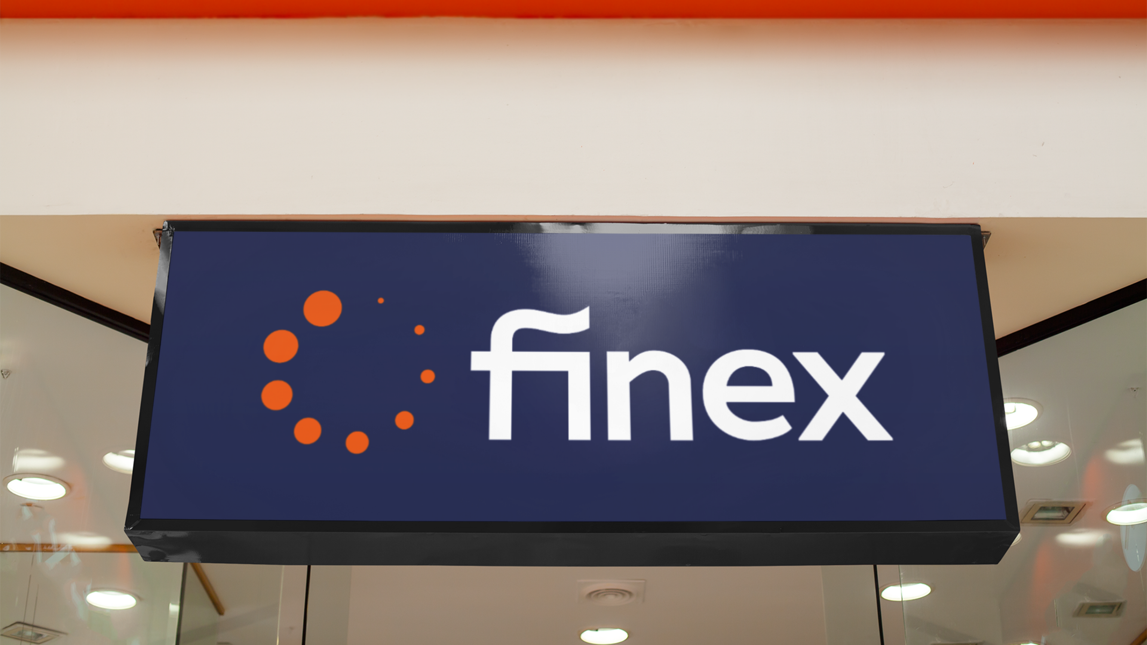
Finex is a modern accounting software brand built around trust, efficiency, and innovation. This project centered on translating these qualities into a visual identity that feels intuitive and scalable, mirroring the product’s ability to simplify complex financial processes. The branding system was designed to balance professionalism with approachability, giving Finex a cohesive look that supports both everyday usability and long-term growth.
The creative direction focused on a visual tone that felt modern, precise, and trustworthy; anchored by clean typography and a palette that balanced innovation with professionalism. I guided the design system from concept to execution, building scalable assets that simplify complexity and reinforce Finex’s core values. Every element was crafted to project clarity and confidence, ensuring the brand stands apart without relying on tired “tech” clichés.

LOGO DESIGNS
PRIMARY LOGO

ICON VARIATION
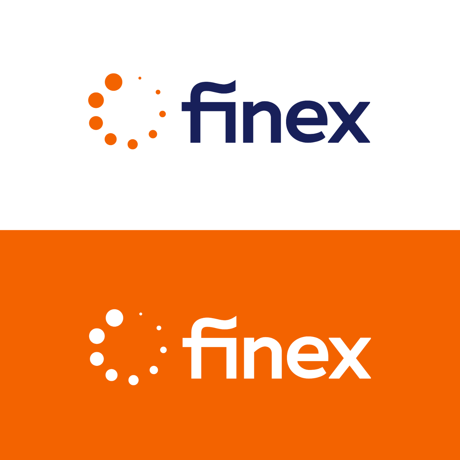
The Finex logo system was designed to convey clarity, scalability, and modern professionalism. The primary mark combines a bold wordmark with a distinctive symbol of orange dots arranged in a dynamic arc, representing growth and forward movement without relying on traditional financial motifs. A simplified icon variation uses the symbol alone, offering flexibility for digital platforms and small-scale applications. Together, the system reinforces Finex’s identity as innovative yet trustworthy, ensuring consistency across every touchpoint.
BRAND ELEMENTS
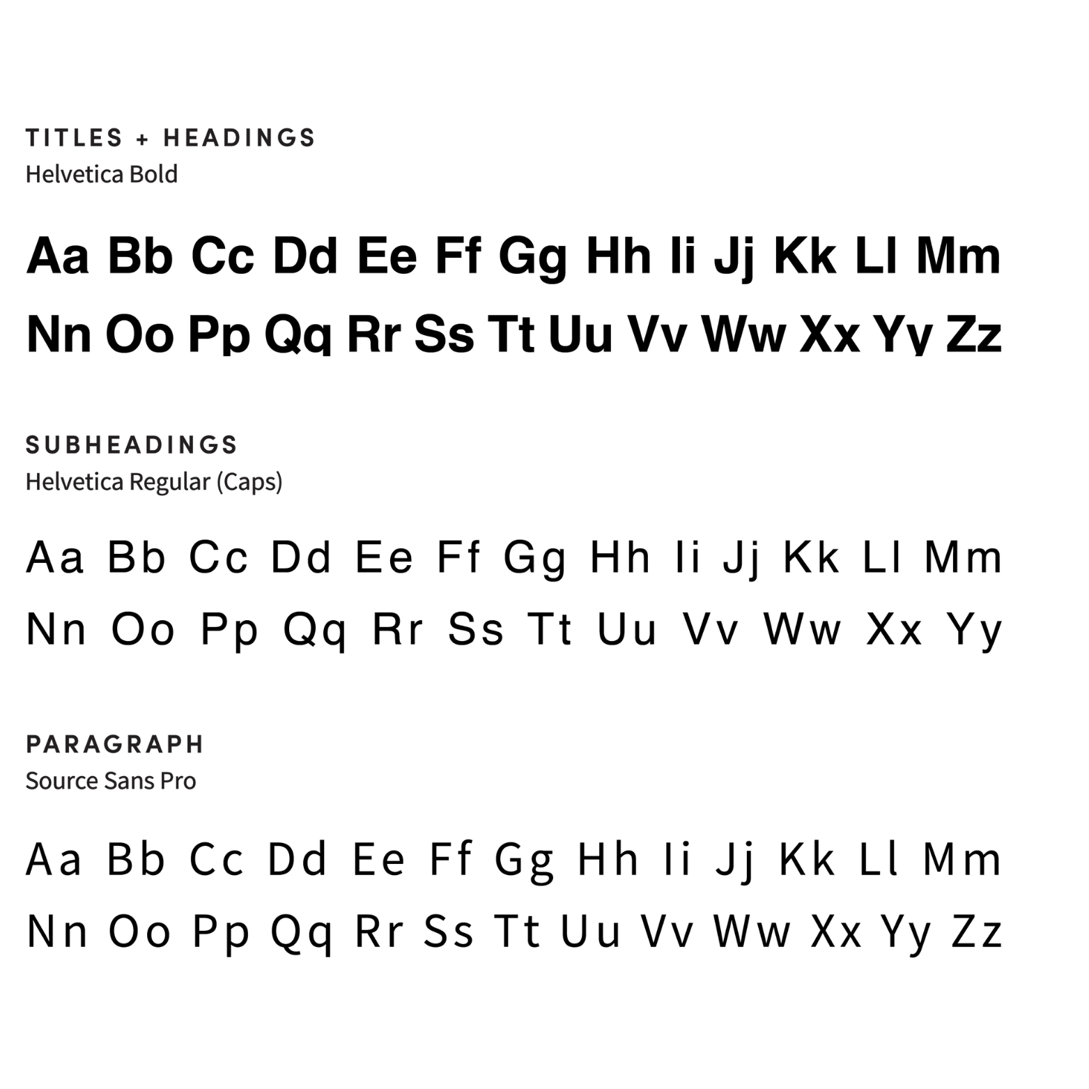
FONT PAIRING
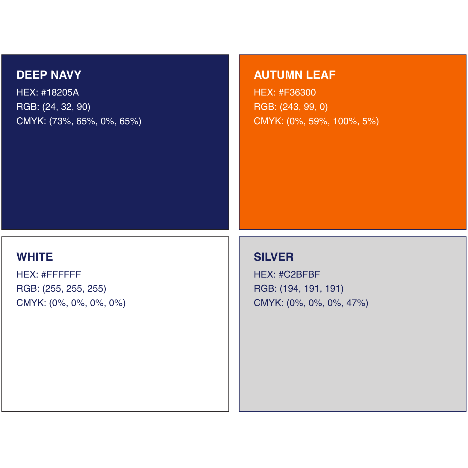
COLOR PALETTE
The Finex brand elements were designed to communicate clarity, trust, and modern efficiency. The color palette combines Deep Navy for stability and professionalism, Autumn Leaf for energy and innovation, and neutral tones of White and Silver to maintain balance and readability across interfaces. Typography reinforces this structure with Helvetica Bold for strong, confident headings, Helvetica Regular for supporting hierarchy, and Source Sans Pro for highly legible body text. Together, these elements create a clean visual language that reflects the platform’s ability to simplify complex financial tasks.
SOCIAL POSTS
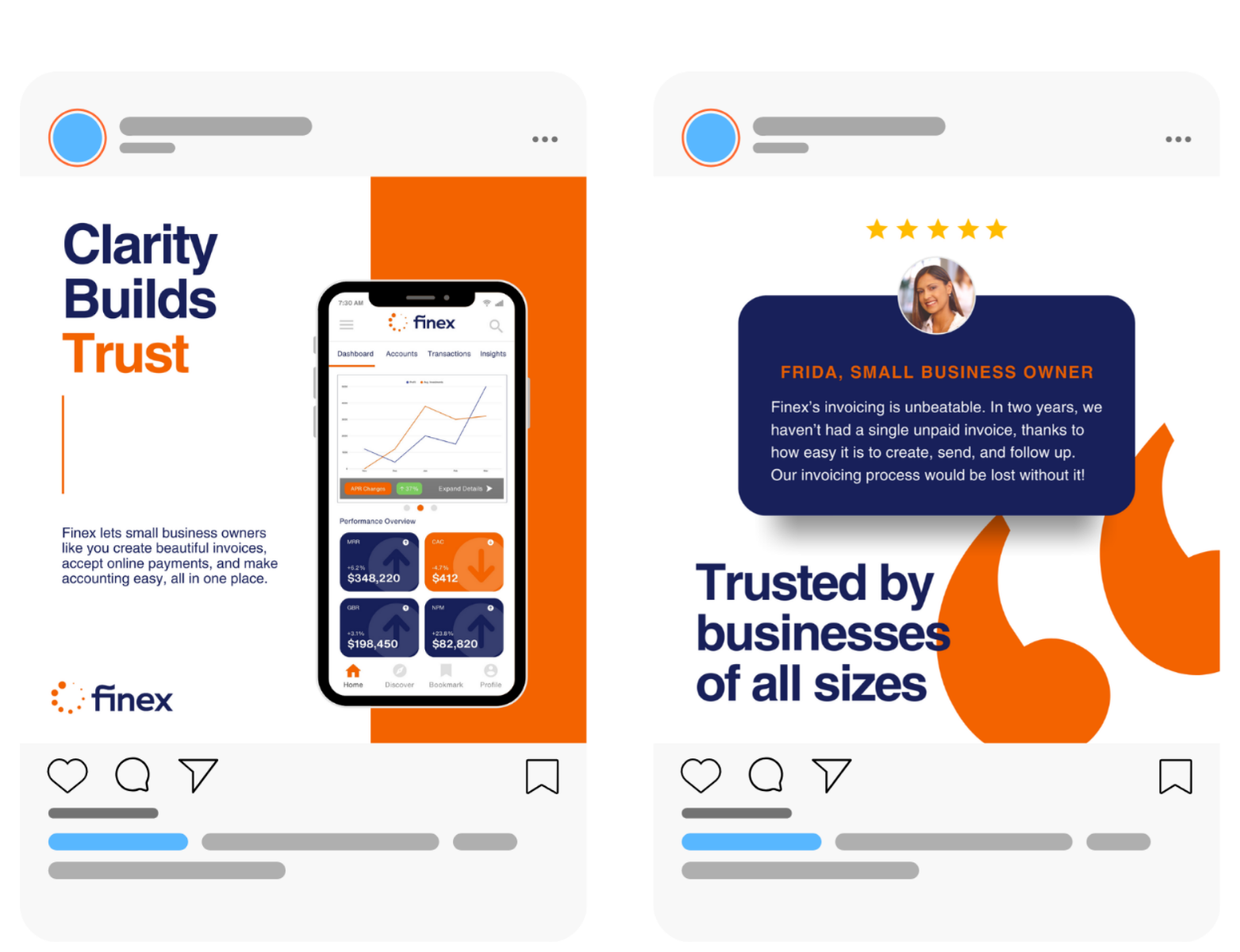
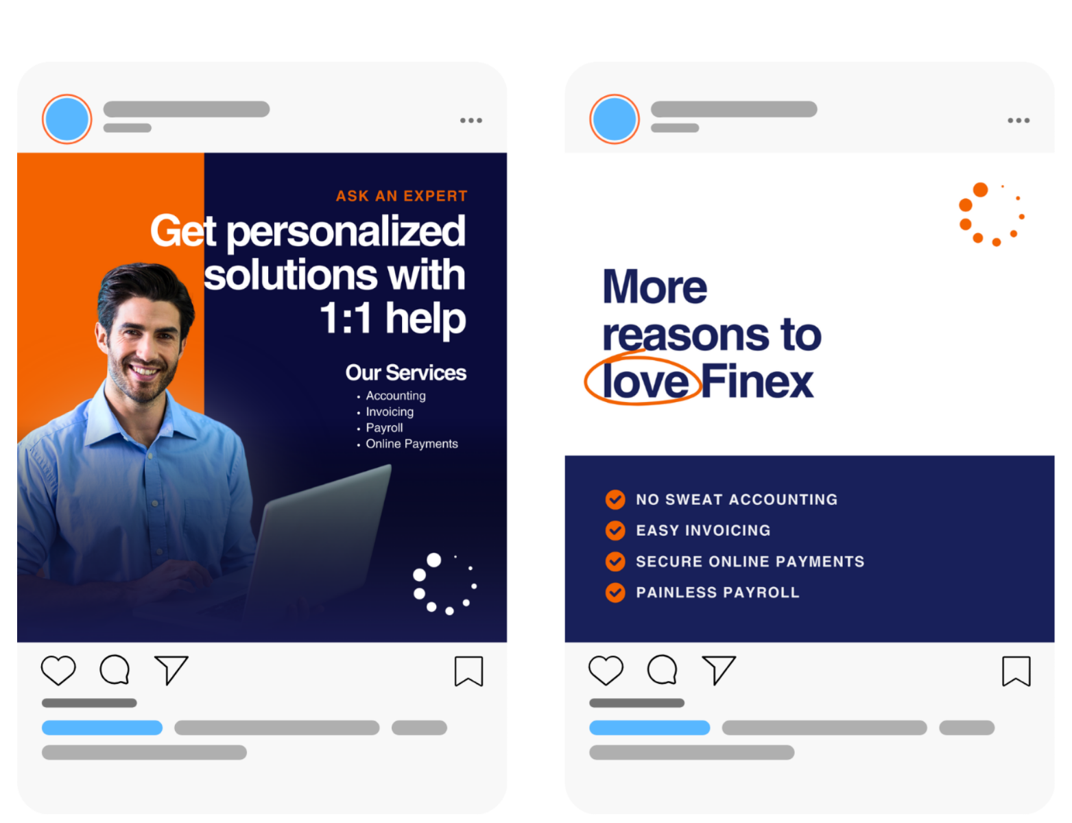
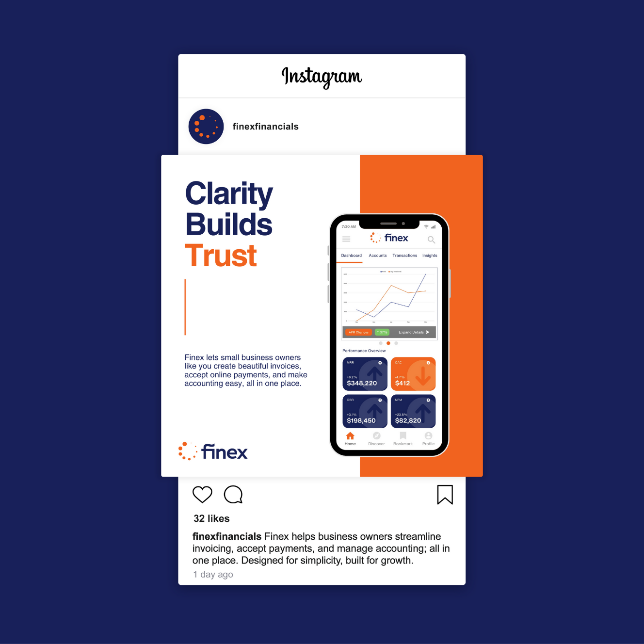
A set of four social media templates was developed to maintain visual consistency across Finex’s digital presence. The layouts prioritize clarity and readability, using structured grids, bold headlines, and strategic color accents to highlight key information. The templates allow for flexibility while maintaining a recognizable style that aligns with the overall brand system. This approach ensures that updates, announcements, and educational content feel cohesive and professional across platforms.
BUSINESS CARDS
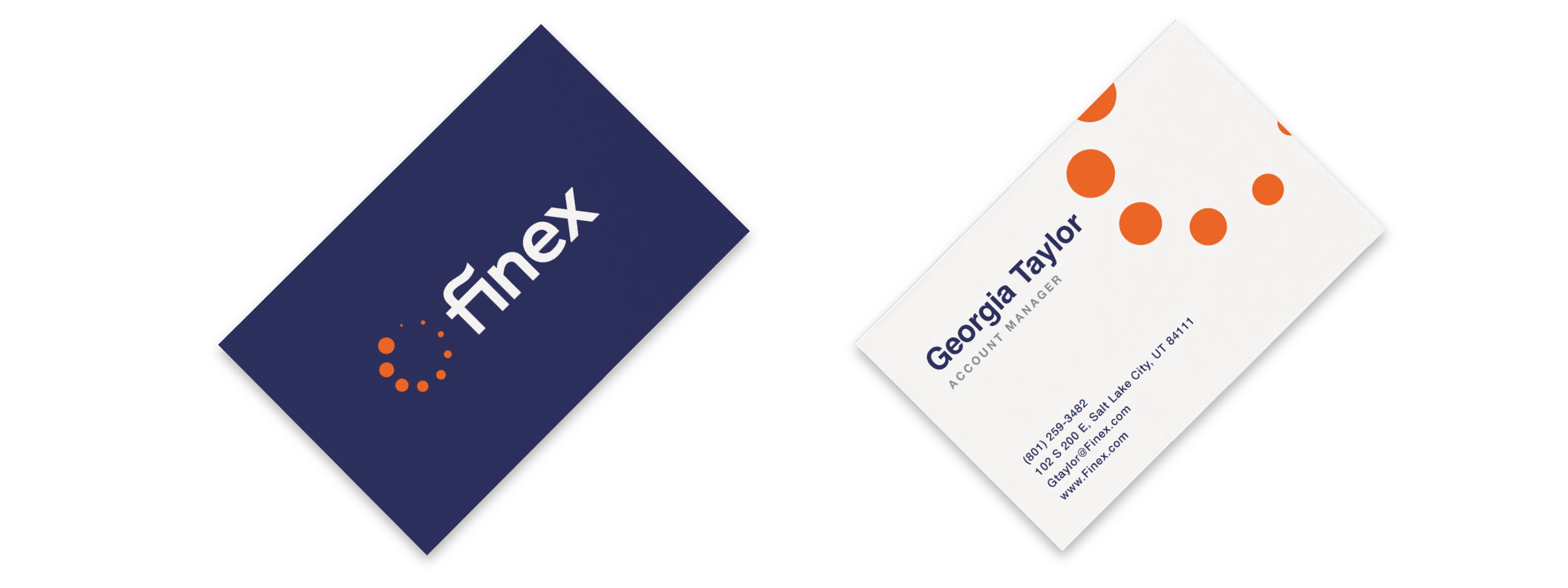
Print collateral was kept clean and minimal. The card design features the full horizontal logo on the front, with a simple, minimal look on the back, and uses a clean layout with subtle brand accents, Finex was looking for a design that helps balance a with personality. These materials were designed to be easy to reproduce while maintaining visual consistency across client interactions.
BRAND GUIDE
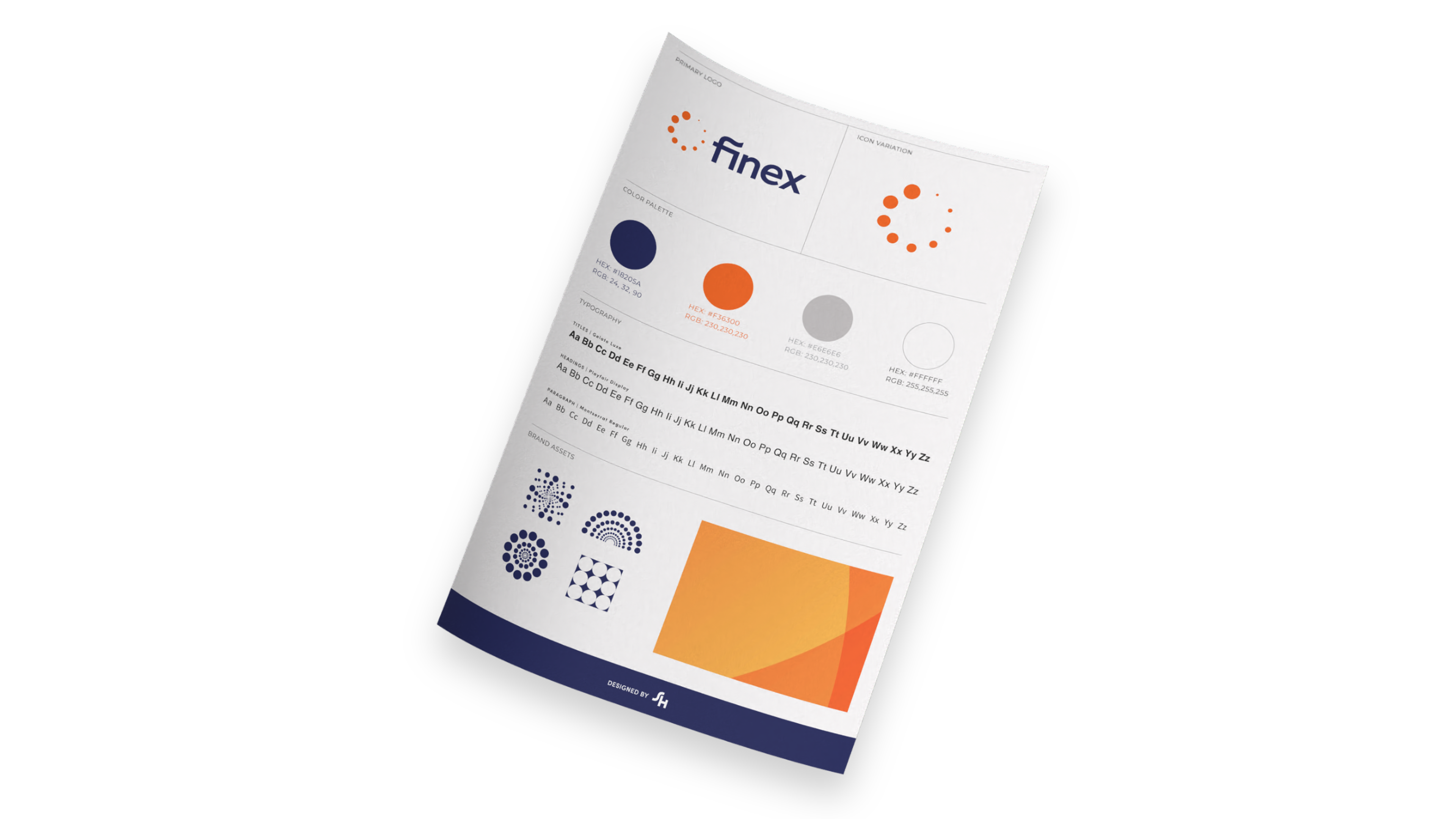
The Finex brand guide sheet provides a concise reference for maintaining visual consistency across all brand applications. It outlines key elements including logo usage, typography hierarchy, color specifications, and supporting design assets. By clearly defining these standards, the guide ensures the brand remains recognizable and cohesive as it scales across digital platforms, marketing materials, and product interfaces. This foundation allows teams to apply the identity confidently while preserving the integrity of the Finex brand.